Statistics > Box Plot
Box Plots
In 1977, John Tukey published an efficient method for displaying a five-number data summary. The graph is called a boxplot (also known as a box and whisker plot) and summarizes the following statistical measures:
- median
- upper and lower quartiles
- minimum and maximum data values
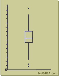
The following is an example of a boxplot.
Box Plot

The plot may be drawn either vertically as in the above diagram, or horizontally.
Interpreting a Boxplot
The boxplot is interpreted as follows:
The box itself contains the middle 50% of the data. The upper edge (hinge) of the box indicates the 75th percentile of the data set, and the lower hinge indicates the 25th percentile. The range of the middle two quartiles is known as the inter-quartile range.
The line in the box indicates the median value of the data.
If the median line within the box is not equidistant from the hinges, then the data is skewed.
The ends of the vertical lines or "whiskers" indicate the minimum and maximum data values, unless outliers are present in which case the whiskers extend to a maximum of 1.5 times the inter-quartile range.
The points outside the ends of the whiskers are outliers or suspected outliers.
Boxplot Enhancements
Beyond the basic information, boxplots sometimes are enhanced to convey additional information:
The mean and its confidence interval can be shown using a diamond shape in the box.
The expected range of the median can be shown using notches in the box.
The width of the box can be varied in proportion to the log of the sample size.
Advantages of Boxplots
Boxplots have the following strengths:
- Graphically display a variable's location and spread at a glance.
- Provide some indication of the data's symmetry and skewness.
- Unlike many other methods of data display, boxplots show outliers.
- By using a boxplot for each categorical variable side-by-side on the same graph, one quickly can compare data sets.
One drawback of boxplots is that they tend to emphasize the tails of a distribution, which are the least certain points in the data set. They also hide many of the details of the distribution. Displaying a histogram in conjunction with the boxplot helps in this regard, and both are important tools for exploratory data analysis.
Statistics > Box Plot


