Statistics > Histograms
The Histogram
The histogram is a summary graph showing a count of the data points falling in various ranges. The effect is a rough approximation of the frequency distribution of the data.
The groups of data are called classes, and in the context of a histogram they are known as bins, because one can think of them as containers that accumulate data and "fill up" at a rate equal to the frequency of that data class.
Consider the exam scores of a group of students. By defining data classes each spanning an interval of 10 points and counting the number of scores in each data class, a frequency table can be constructed as in the following example:
Frequency Table
Group |
Count |
0 - 9 |
1 |
10 - 19 |
2 |
20 - 29 |
3 |
30 - 39 |
4 |
40 - 49 |
5 |
50 - 59 |
4 |
60 - 69 |
3 |
70 - 79 |
2 |
80 - 89 |
2 |
90 - 99 |
1 |
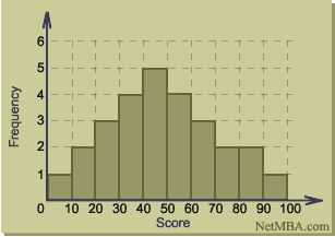
To construct the histogram, groups are plotted on the x axis and their frequencies on the y axis. The following is a histogram of the data in the above frequency table.
Histogram

Information Conveyed by Histograms
Histograms are useful data summaries that convey the following information:
- The general shape of the frequency distribution (normal, chi-square, etc.)
- Symmetry of the distribution and whether it is skewed
- Modality - unimodal, bimodal, or multimodal
The histogram of the frequency distribution can be converted to a probability distribution by dividing the tally in each group by the total number of data points to give the relative frequency.
The shape of the distribution conveys important information such as the probability distribution of the data. In cases in which the distribution is known, a histogram that does not fit the distribution may provide clues about a process and measurement problem. For example, a histogram that shows a higher than normal frequency in bins near one end and then a sharp drop-off may indicate that the observer is "helping" the results by classifying extreme data in the less extreme group.
Bin Width
The shape of the histogram sometimes is particularly sensitive to the number of bins. If the bins are too wide, important information might get omitted. For example, the data may be bimodal but this characteristic may not be evident if the bins are too wide. On the other hand, if the bins are too narrow, what may appear to be meaningful information really may be due to random variations that show up because of the small number of data points in a bin. To determine whether the bin width is set to an appropriate size, different bin widths should be used and the results compared to determine the sensitivity of the histogram shape with respect to bin size. Bin widths typically are selected so that there are between 5 and 20 groups of data, but the appropriate number depends on the situation.
Histograms and Boxplots
The histogram provides a graphical summary of the shape of the data's distribution. It often is used in combination with other statistical summaries such as the boxplot, which conveys the median, quartiles, and range of the data.
Statistics > Histograms


